04/27/2020Comments are off for this post.

Brave the Wild | Show Package

Brave Wilderness—a YouTube channel headed by Coyote Peterson—was making the jump from online to broadcast with their new show Brave the Wild on Animal Planet. I worked to define the show’s graphic aesthetic, and from there, oversee the production all of the assets needed for their first season. 

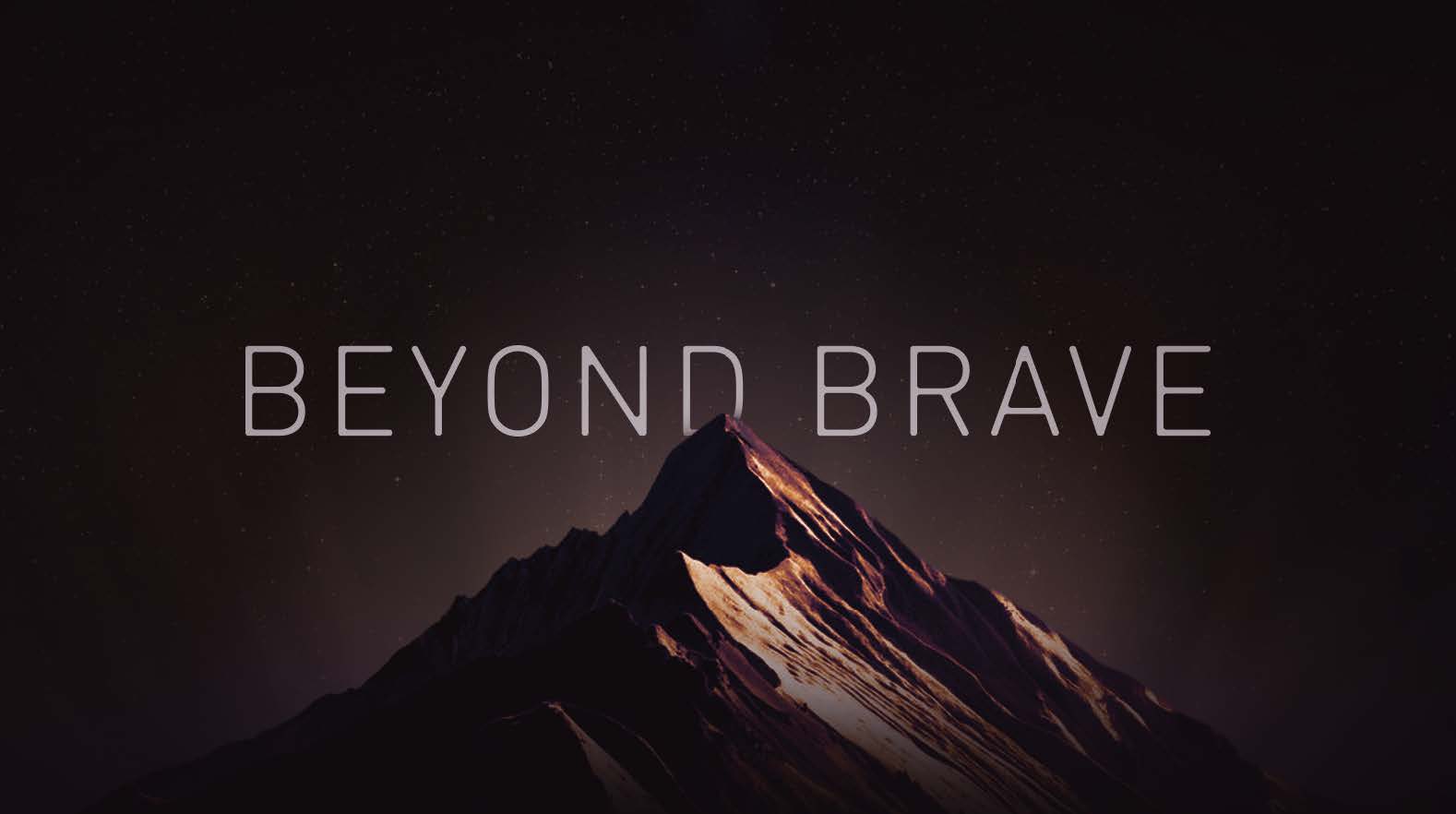
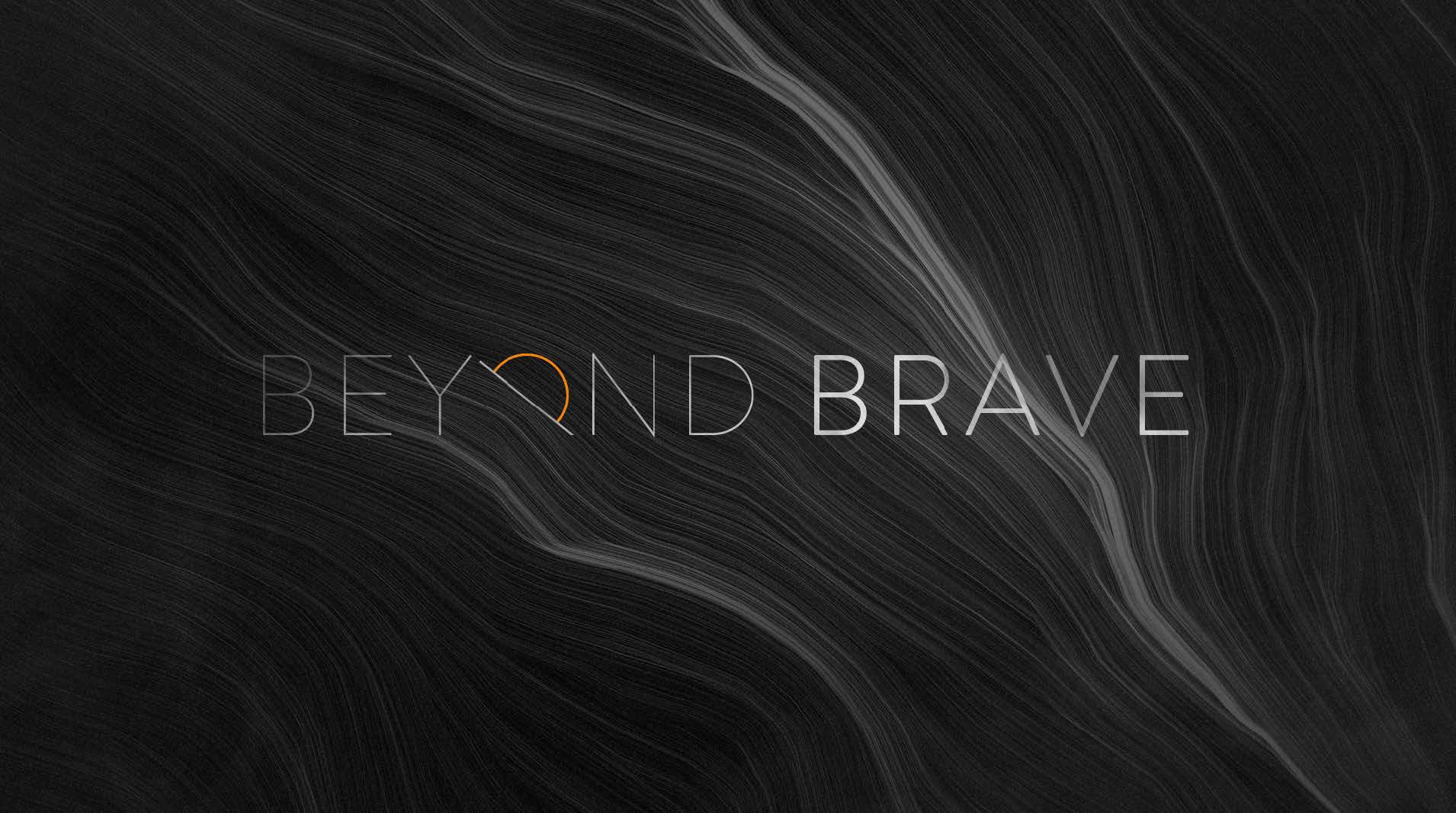
We began with exploring the logo/title treatment, as this would inform the look and feel of the rest of the graphics that followed. NOTE: About halfway through the design process, the show's title was changed from Beyond Brave to Coyote Peterson: Brave the Wild.

Final Logo/Title Design

From there, the team began building out the other assets needed for the show, including a fully customizable, realistic Earth that worked natively in After Effects. The template makes use of the VC Orb plugin as well as 8K texture maps. It also gave the Brave Wilderness team the ability to search for locations by name, and have the show's location marker auto-snap to that location in 3D space, making the setup and rendering of these maps (over 15 in total) simple and easy.
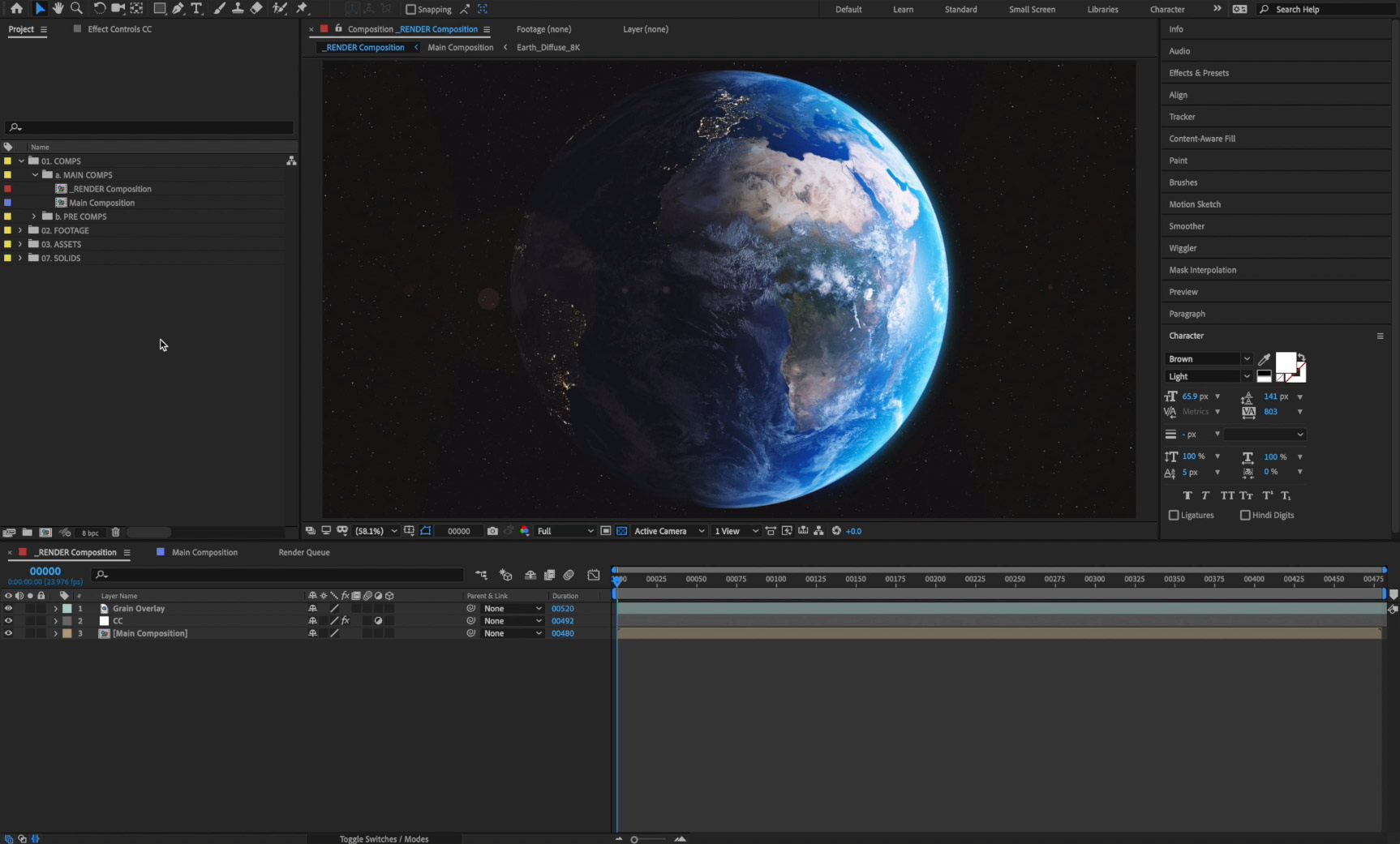
3D Earth After Effects Template

Another huge undertaking for this project was the illustrated animal fact portion of the show, known as infopods. Our idea was to present these like Coyote himself takes notes in the field—through a journal. For these sections, we made over 50 custom illustrations of interesting animal facts and brought them to life through subtle camera moves and animation.

Credits


Client: Wilderness Productions | Animal Planet
Director: Karl Hein
Producer: Kate Wilke
Designers: Karl Hein, Jonny Sidlo, Audrey Stemen
Illustrator: Christine Lee
Animator: Karl Hein
Editor: Kurt Keaner

01/13/2019Comments are off for this post.

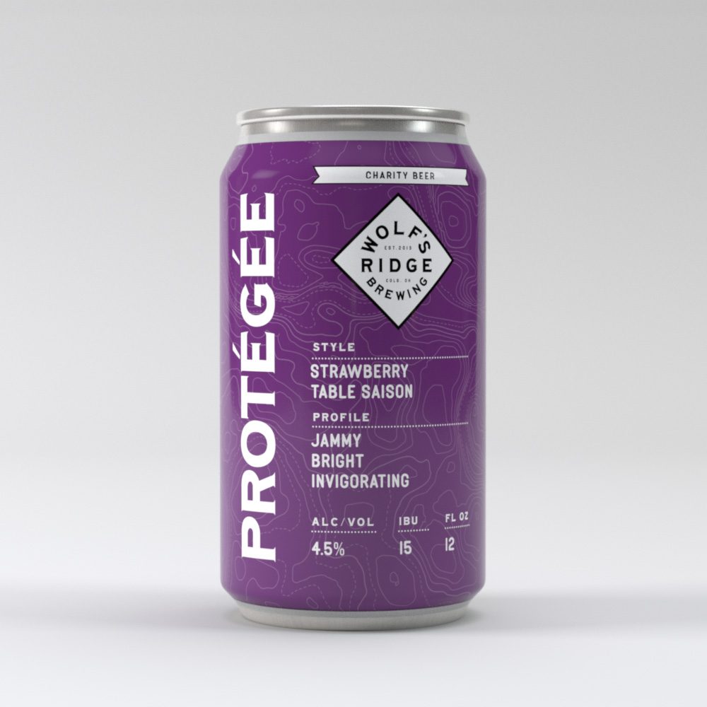
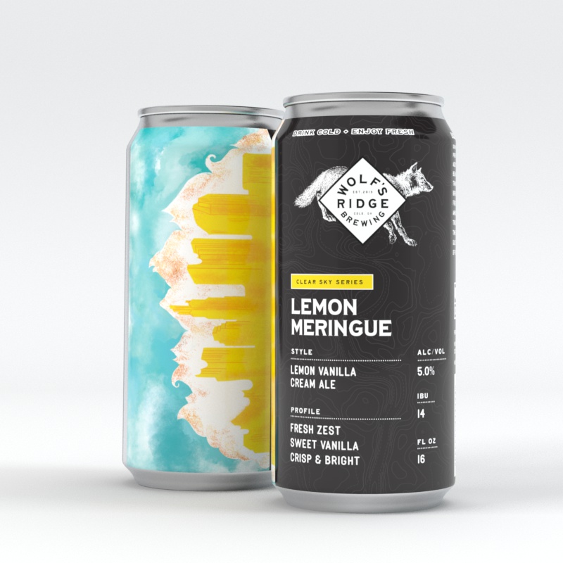
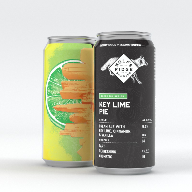
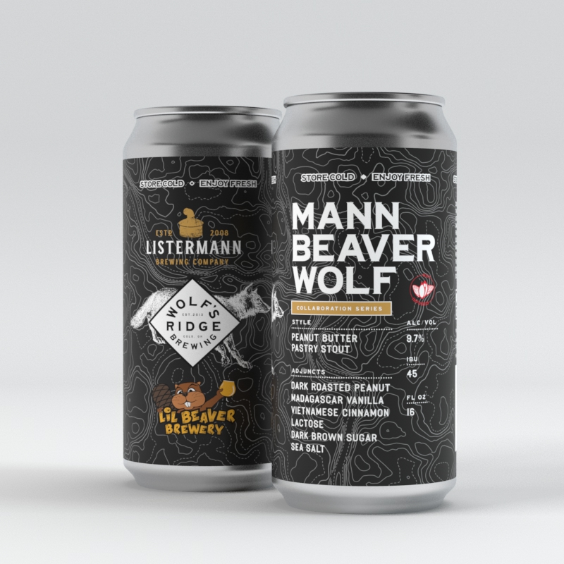
Label Designs

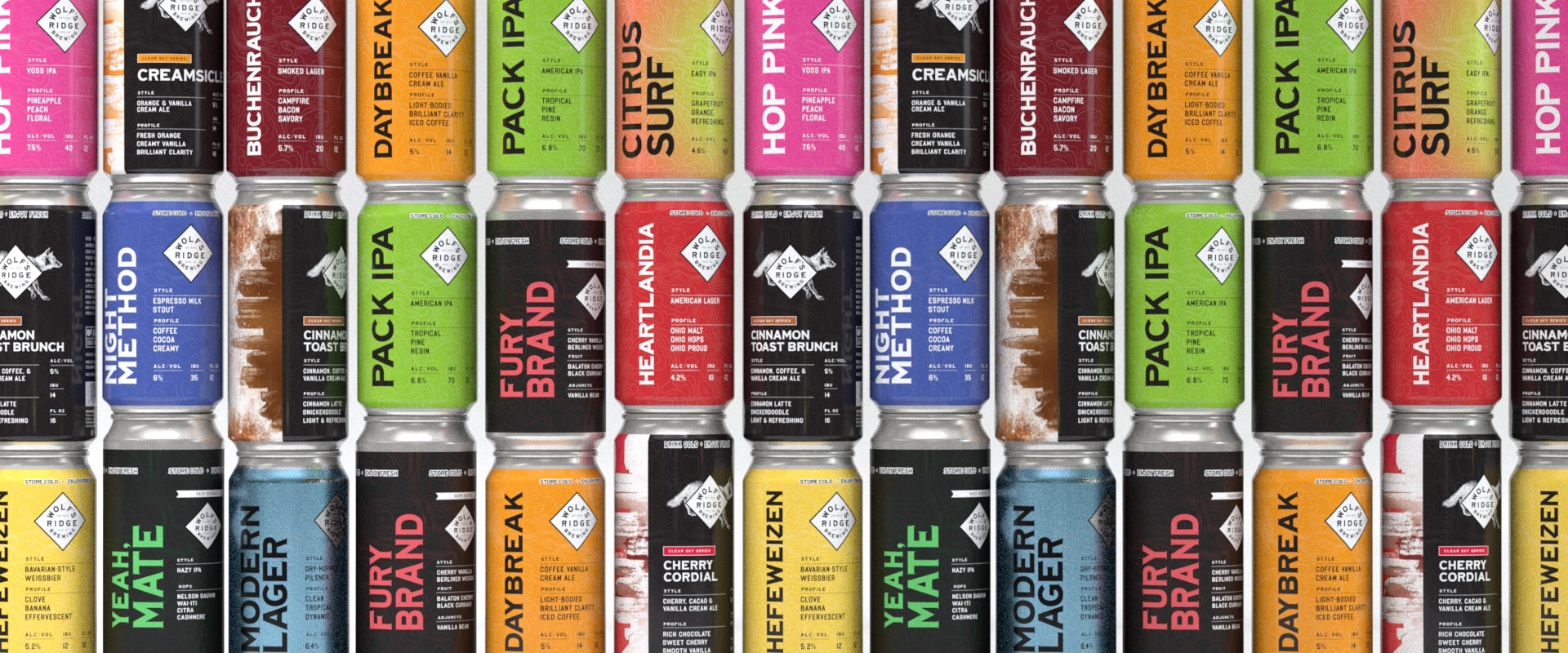
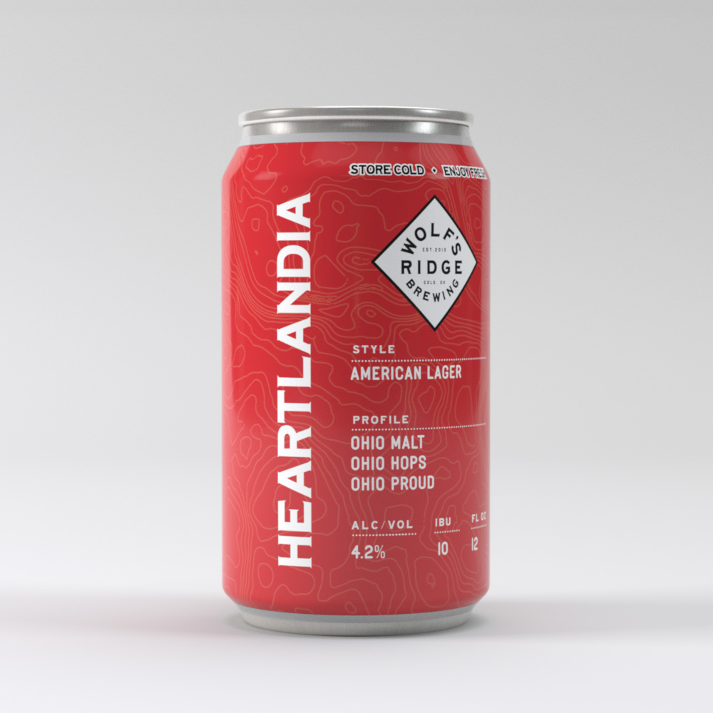
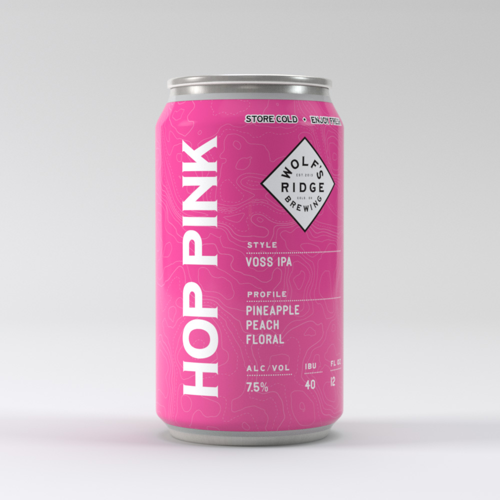
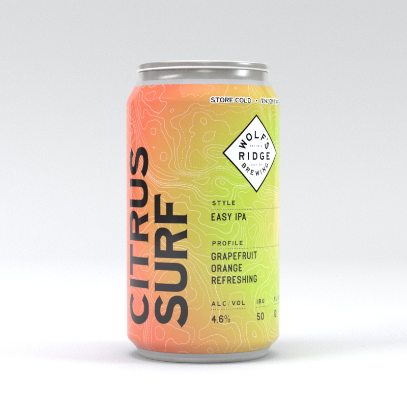
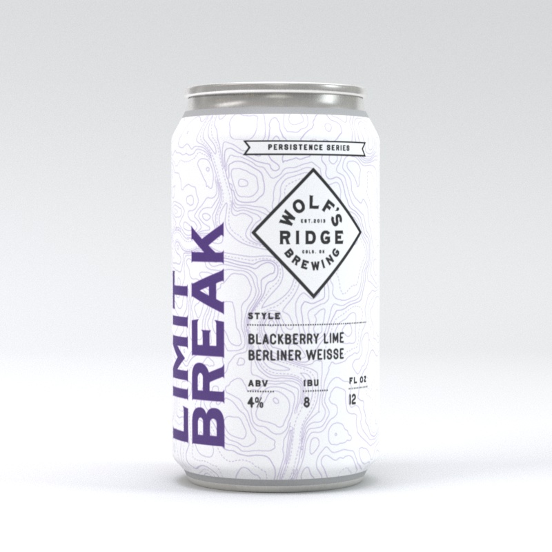
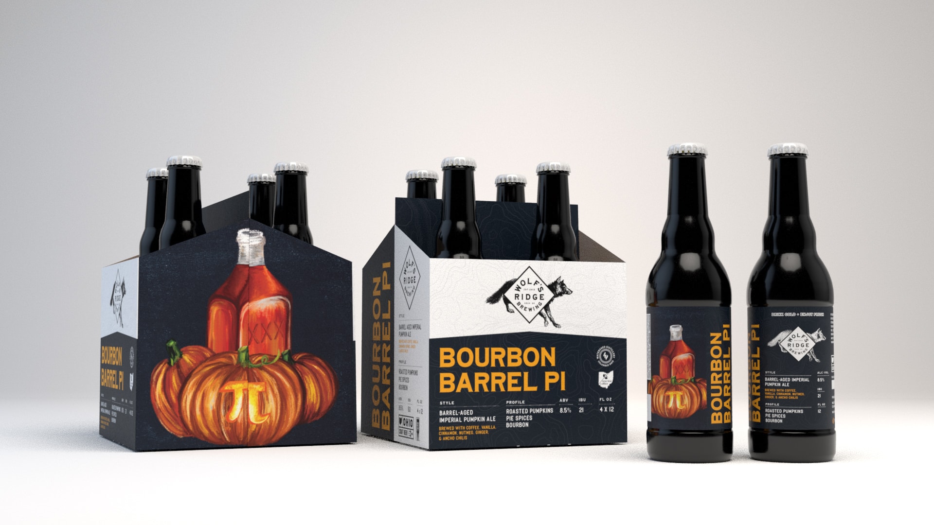
After designing Wolf’s Ridge Brewing’s specialty labels for the better part of four years, they approached Spacejunk to help them redesign their full line of packaging to allow more speed and flexibility when creating new and limited-run beers. They also wanted to maintain a strong and eye-catching brand presence on store shelves, as they were beginning to distribute further outside of the Columbus region where they’re well known.

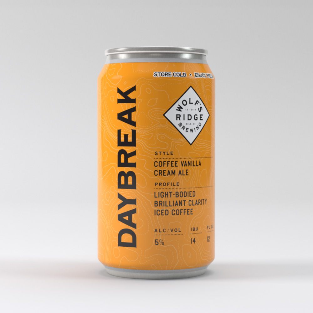
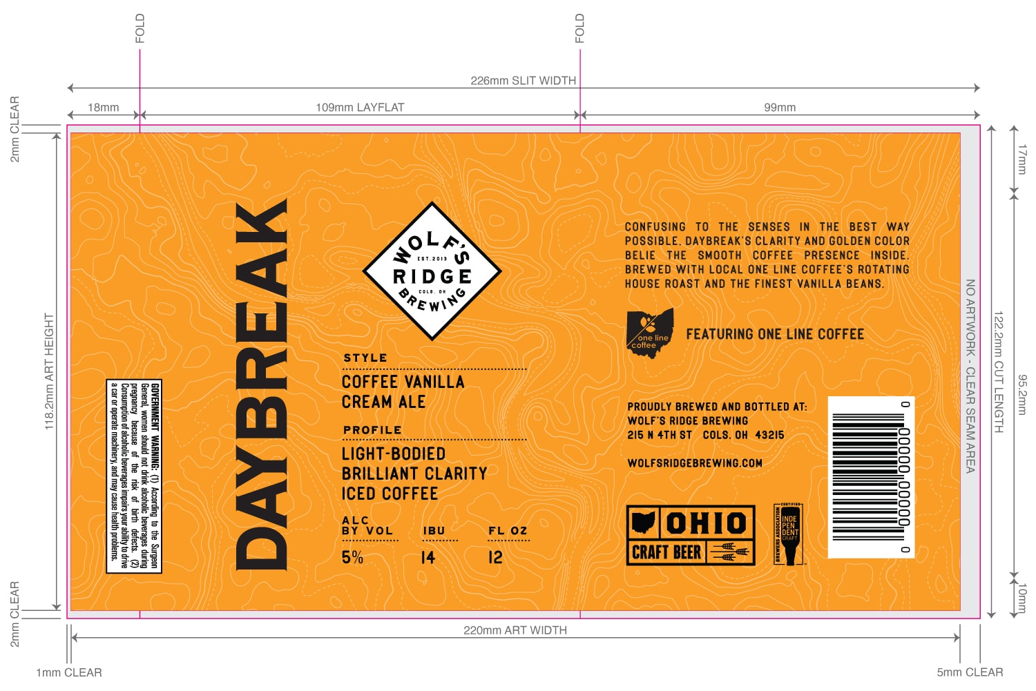
The main goal of the designs was to allow the internal WRB team to create and modify beer labels in-house. So I set about creating a template that would work well for their wide range of beers (~25 at the time of the project) while also being easy enough to navigate that a non-professional designer could work with the Illustrator files.

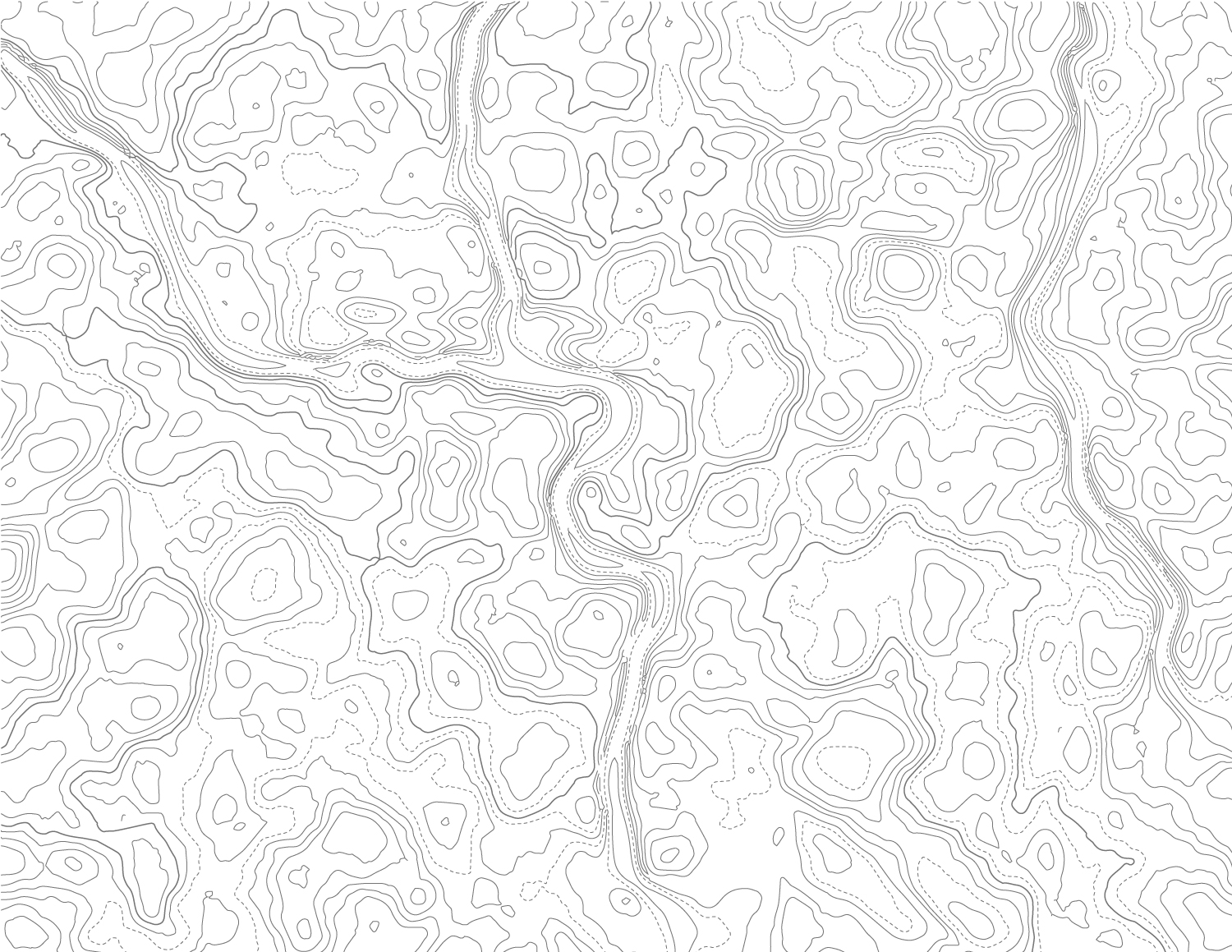
The designs had to be “simple,” with large blocks of type and minimal need for additional graphics. The team at WRB is deeply connected to the Columbus community, so showing that connection was very important. Another part of their history is their name actually comes from the old name for this area of Ohio. So, the main (and oftentimes only) graphic, outside of the logo, is a custom topographic map of Columbus, to tie into the history and location of where WRB is located.


Credits:

Client: Wolf’s Ridge Brewing
Art Director: Karl Hein
Designer: Christine Lee
3D Artists: Dan Hildebrand, Karl Hein

10/21/2016Comments are off for this post.

Baskets: Promo Concepts

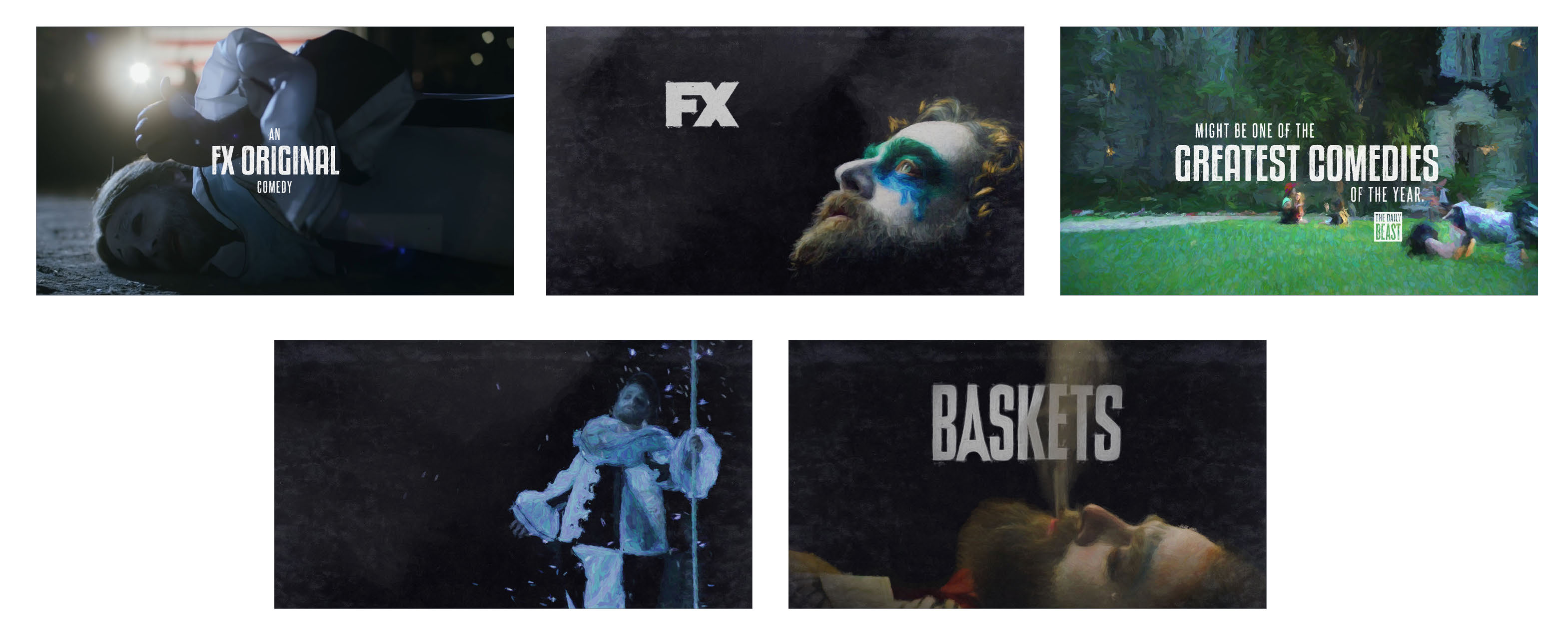
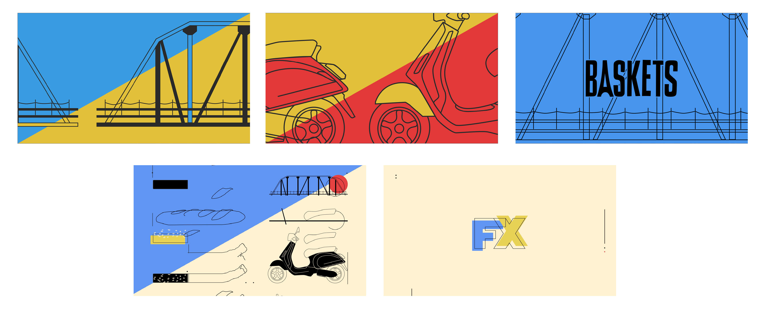
For the second season of their hit show Baskets, FX Networks came to Spacejunk asking for a creative pitch for the promo graphics they would run throughout the season. We presented 3 concepts, all based around the show's main themes, with a dash of Paris in each. While we ultimately didn't win the pitch, the work was stellar and we all had a blast developing the ideas.

Initial working type layouts

Confetti on a Parisian Street


Velvet Renoir


Objets d'un Bouffon


Director: Karl Hein
Producer: Andrew Schneider
Designers: Karl Hein, Alex Trimpe
Animators: Chris Meister, Alex Trimpe